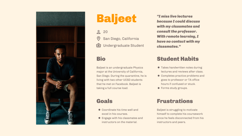
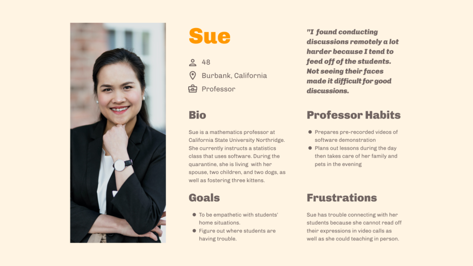
User Peronas
We decided to focus on how to keep students engaged with their classes. We wanted to help them with staying on top of their assignments along with retaining the topics being taught.
Role
UX Designer / Researcher
Scope
User Research
Prototyping
Product Design
Timeline
5 weeks
Collaborators
Tiffany Do, Jackson Grenier, Christina Marquez, John-Paul Pascua
During our first quarter experiencing online learning, we felt disconnected from our professors, fellow classmates, and assignments, especially with classes shifting to an aynschronous approach.
User survey
(59 responses)
User interview
(6 responses)
We decided to focus on how to keep students engaged with their classes. We wanted to help them with staying on top of their assignments along with retaining the topics being taught.


I drew sketches with the idea to create a reward system in interacting with tasks. The rewards center around a cute pet that can get items based on completion of tasks.
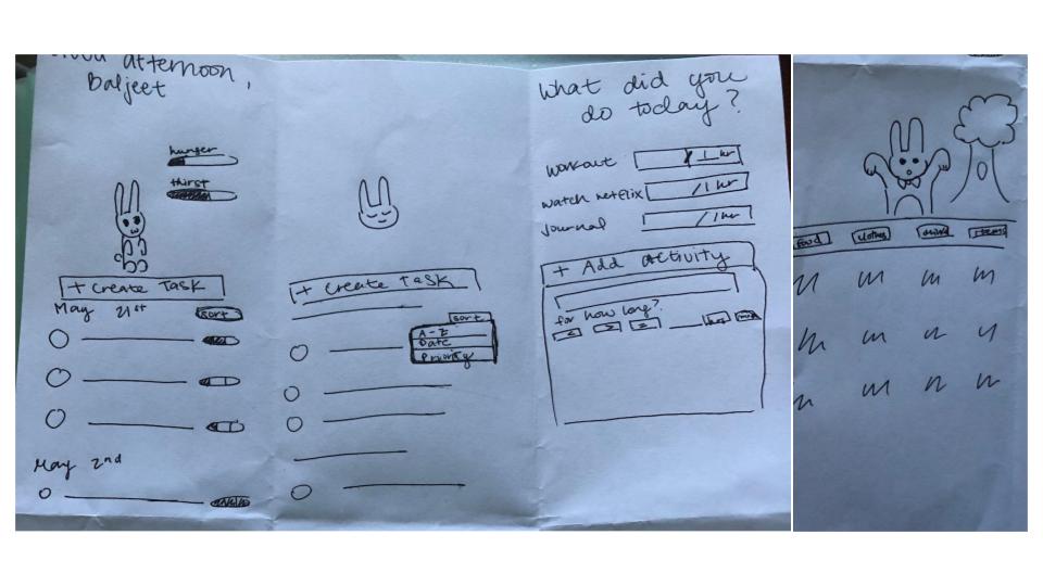
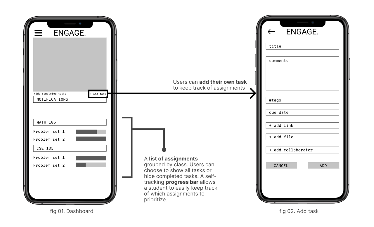
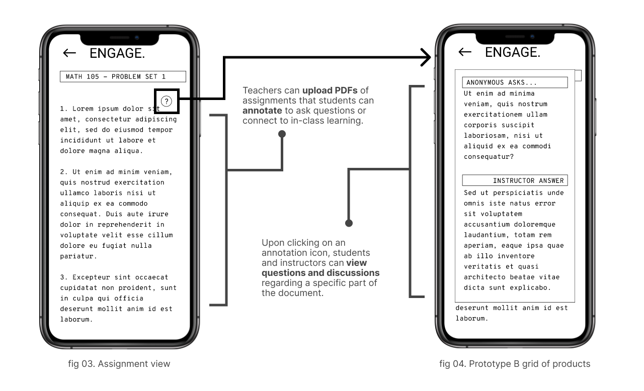
We had several different ideas and each created our own low fidelity prototypes. I created prototypes focusing on the idea that students were struggling to keep up with school work and maintain engagement with with their classes.
User Testing
Some feedback we got was to incorporate the incentive system but make sure it differs from existing apps.
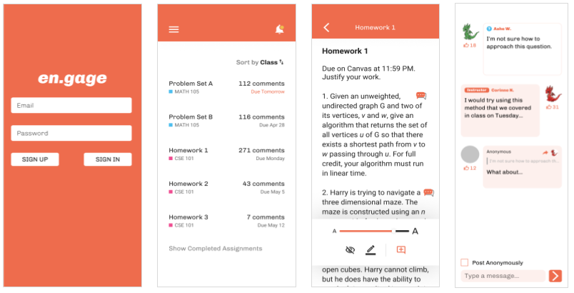
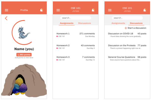
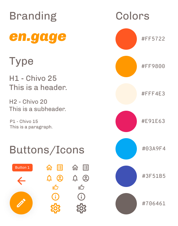
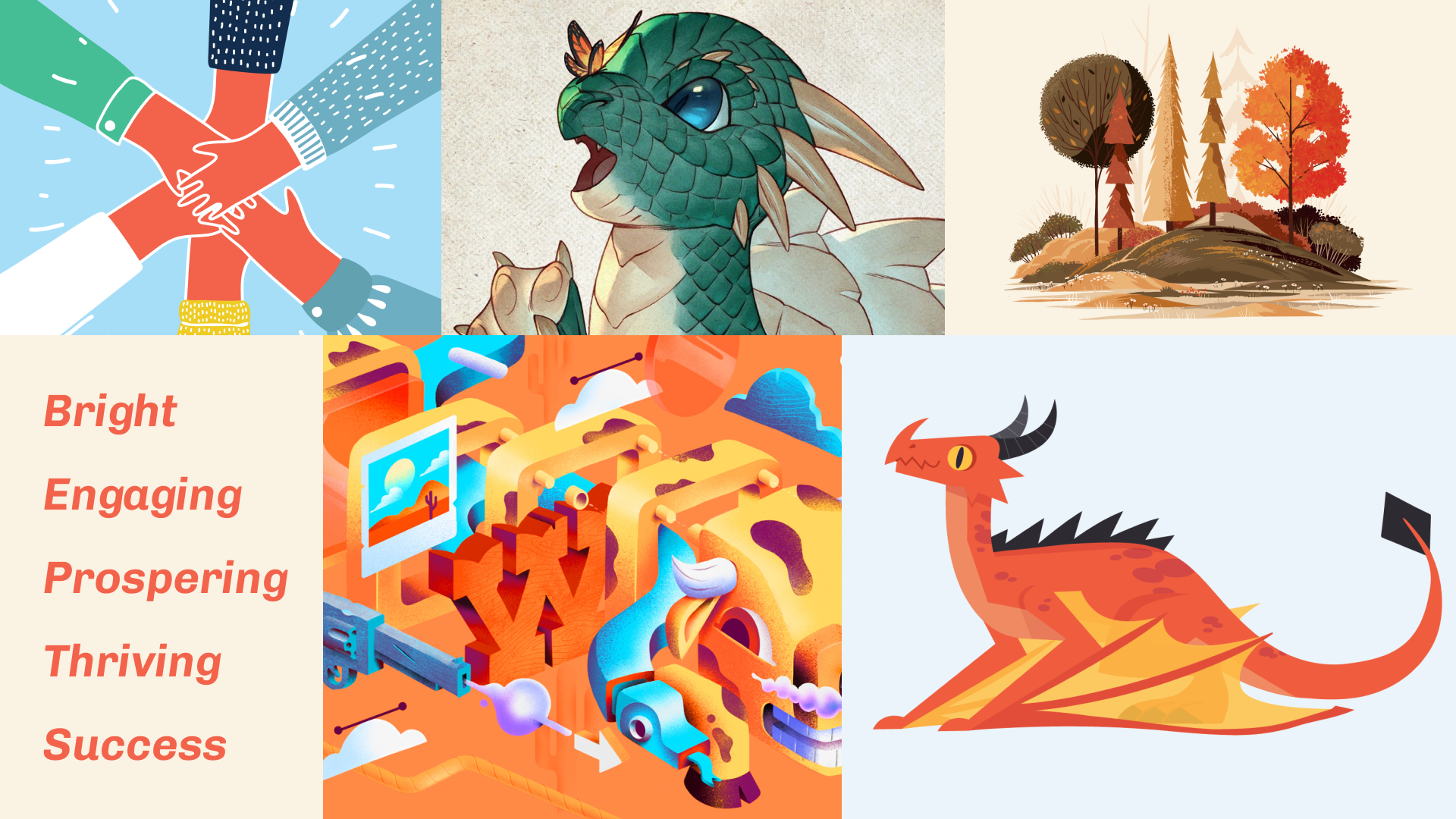
With our first style guide, we created higher fidelity prototypes that were incentive-oriented. We chose a dragon as our mascot because we wanted to evoke feelings of passion and prosperity.
Feedback
Moodboard
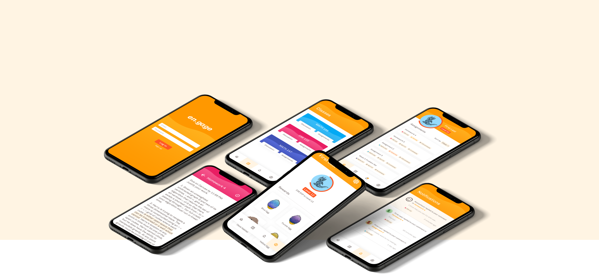
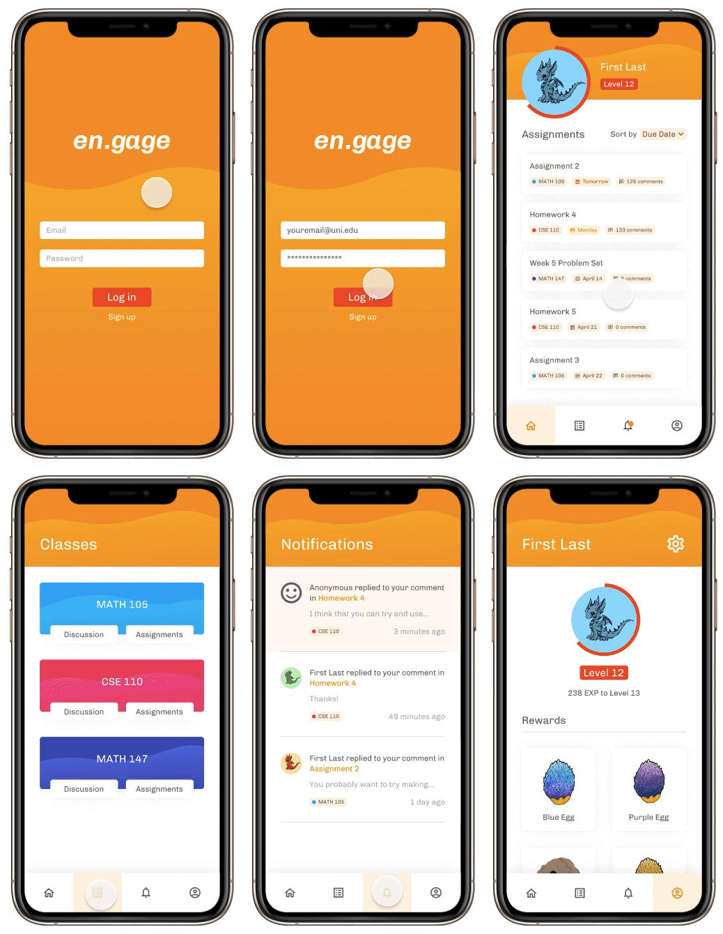
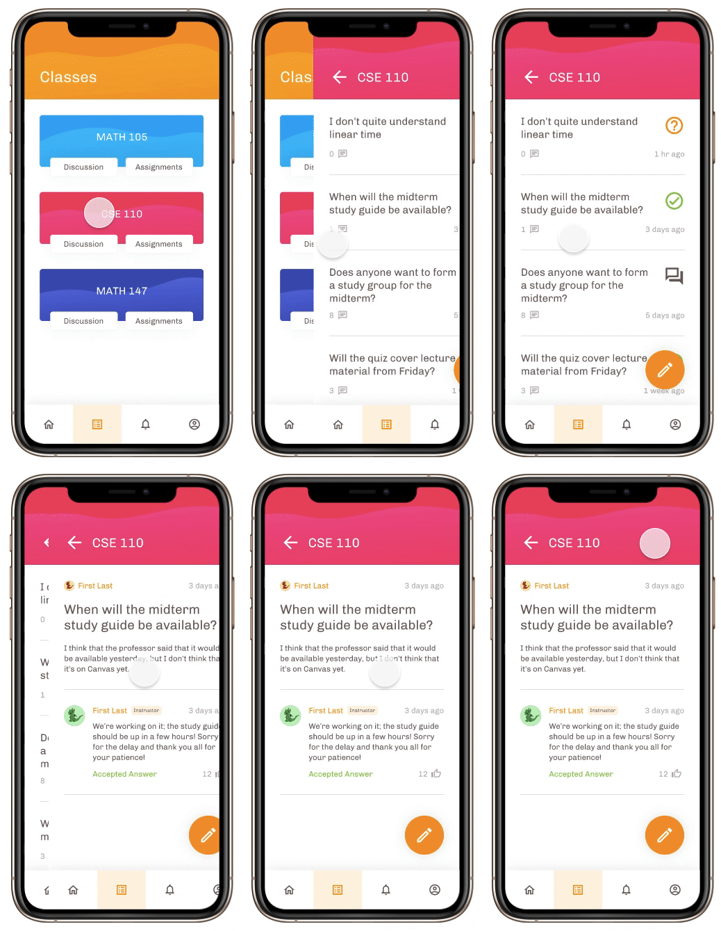
Once users log in, they can keep track of all their assignments, classes, and earn points based on engagement.
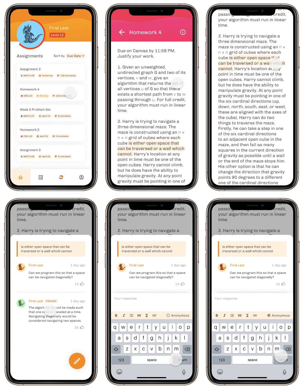
Students and instructors can annotate, ask or respond to questions and comments.
Students are given an anonymous option if they are uncomfortable posting in front of the whole class (they can still get points for ineracting).
Users can also access a discussion board with questions and topics unrelated to assignments.
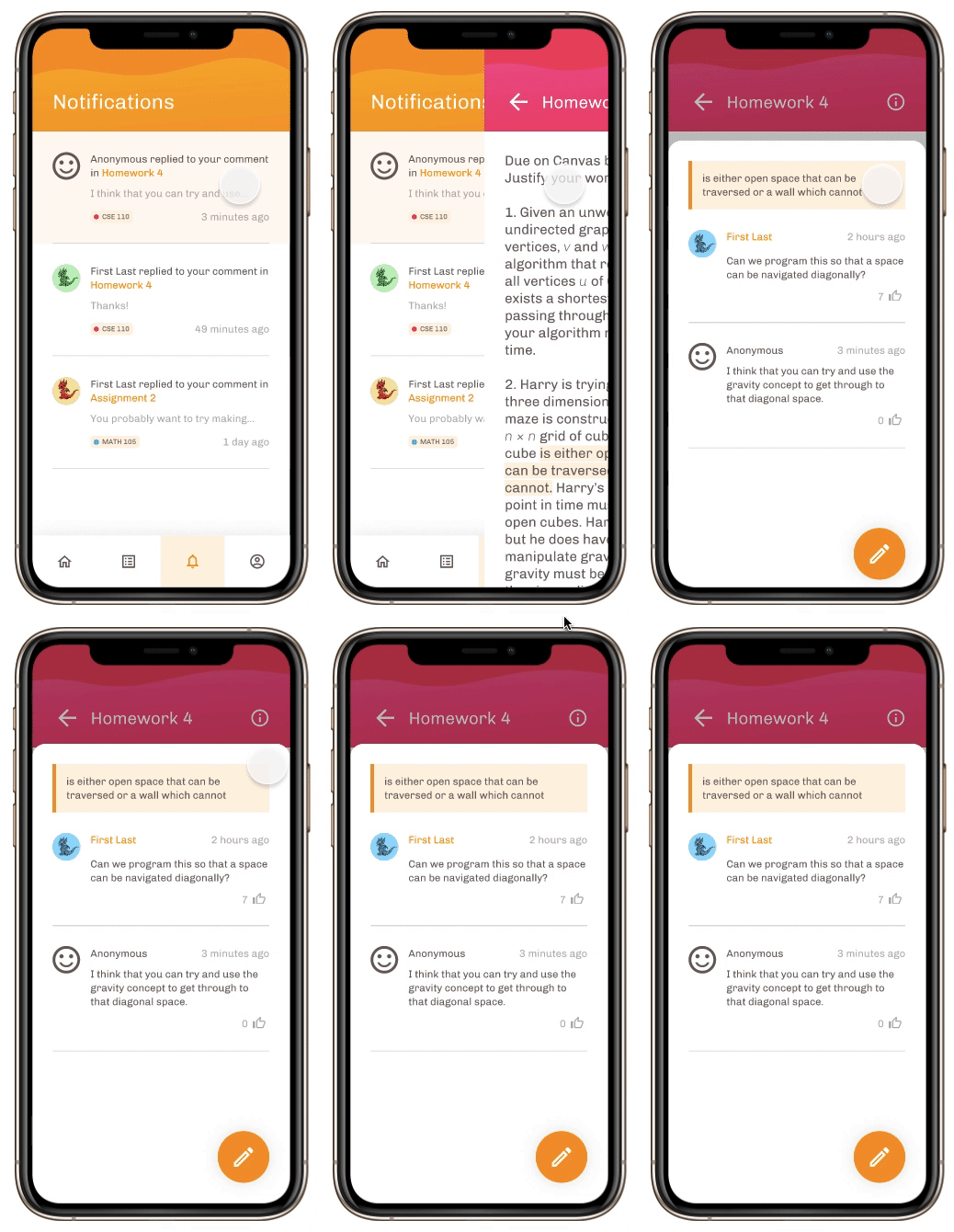
Users get instant notifications if they recently commented or if they are following a annotated question.
This emphasizes social interaction amongst peers.
With the uncertainty of the pandemic and all the issues that we kept discovering during this project, we initially had a hard time figuring out which problems to hone in on and how to resolve them. I'm glad that we decided to focus on a problem that we, as students, could actually relate to.
This was the first project that I helped create branding for. I learned how to make moodboards and style guides that suited our target audience. I had a lot of fun learning about visual design and bringing the prototype to life.
Acknowledgements
I would also like to thank Professor Steven Dow and Teaching Assistant Lu Sun for their guidance in this project. I am also very grateful for my creative teammates for their help in creating this app from scratch!