Your browser does not support JavaScript :(

Improving usability of local gelato store website.

Role

UX Designer / Researcher

Scope

Usability

Prototyping

Web Design

Timeline

10 weeks

Collaborators

Collaborators: Brian Han, Erinna Lin, Ashley Siu

Overview

For our Practicum in Professional Web Design class, my team and I worked with a local San Diego gelato shop, An's Dry Cleaning (yes, that's their name!) to revamp their current website.

How might we inform and educate customers about An's Dry Cleaning?

Research

Client interview

Customer interview
(5 responses)

Non-customer interview
(2 responses)

  1. Discuss with clients regarding their business and requests for website.
  2. Interview users that have been to An's Dry Cleaning (customers)
  3. Interview users that have never been to An's Dry Cleaning (non-customers)
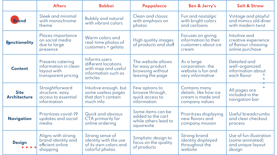
  4. Conduct online research on competitive businesses (other ice cream & gelato stores– local stores and corporations)

Findings

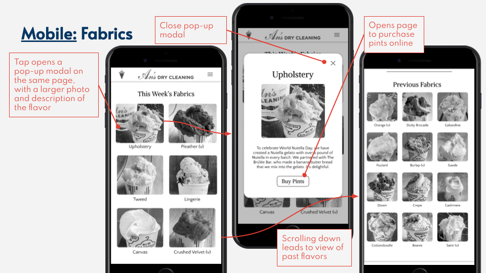
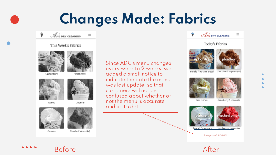
  • Flavors change weekly so customers need to know current and past flavors.

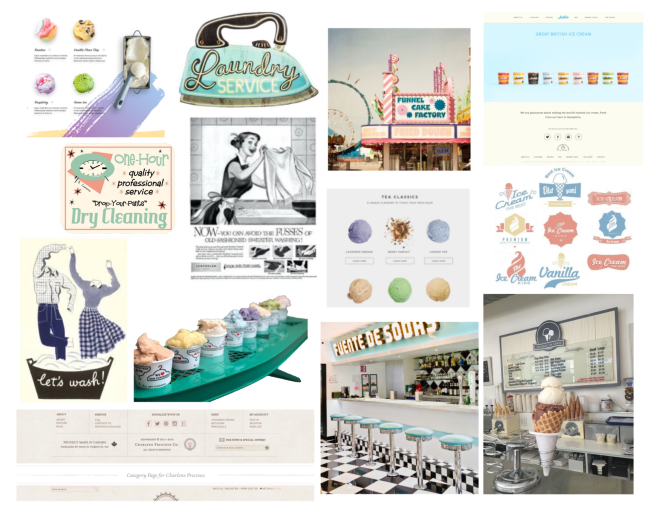
  • Clients want to keep the "vintage" and "mom & pop shop" feel.

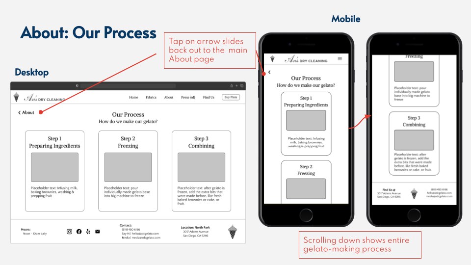
  • Clients want to better connect with customers through education of the gelato-making process and finding out which are some popular flavors to bring back.

Competitive Analysis
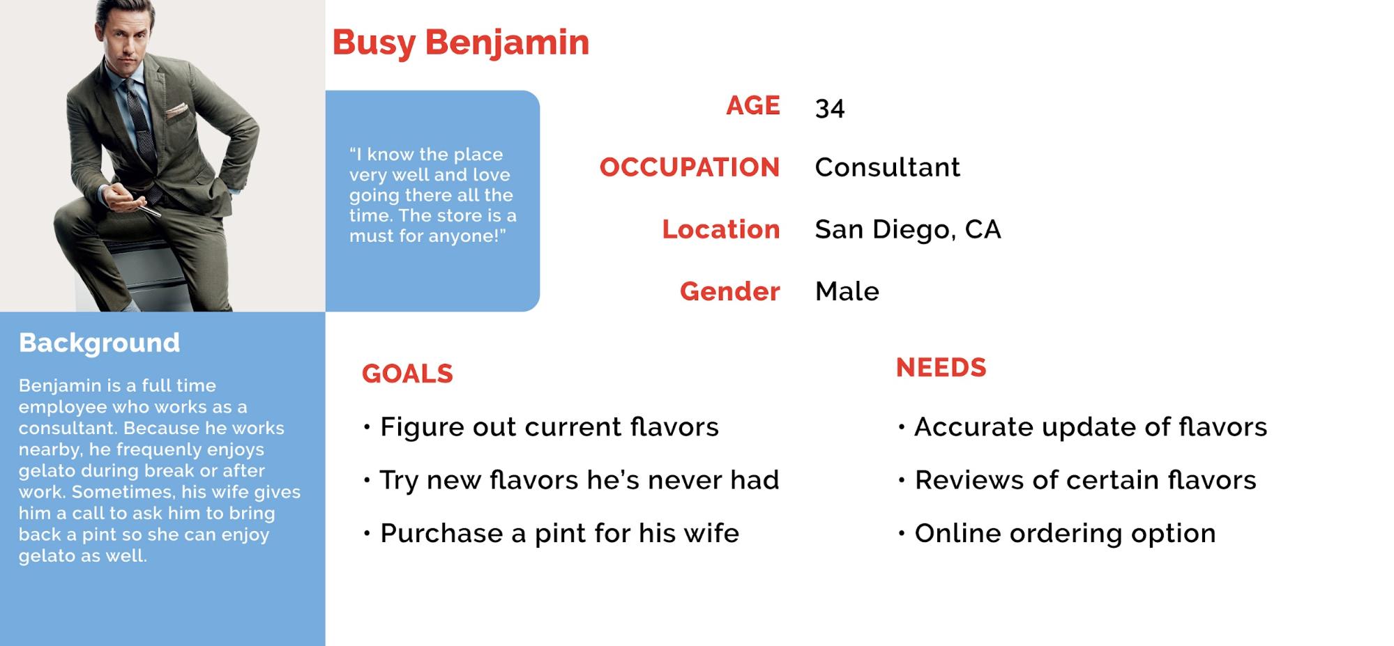
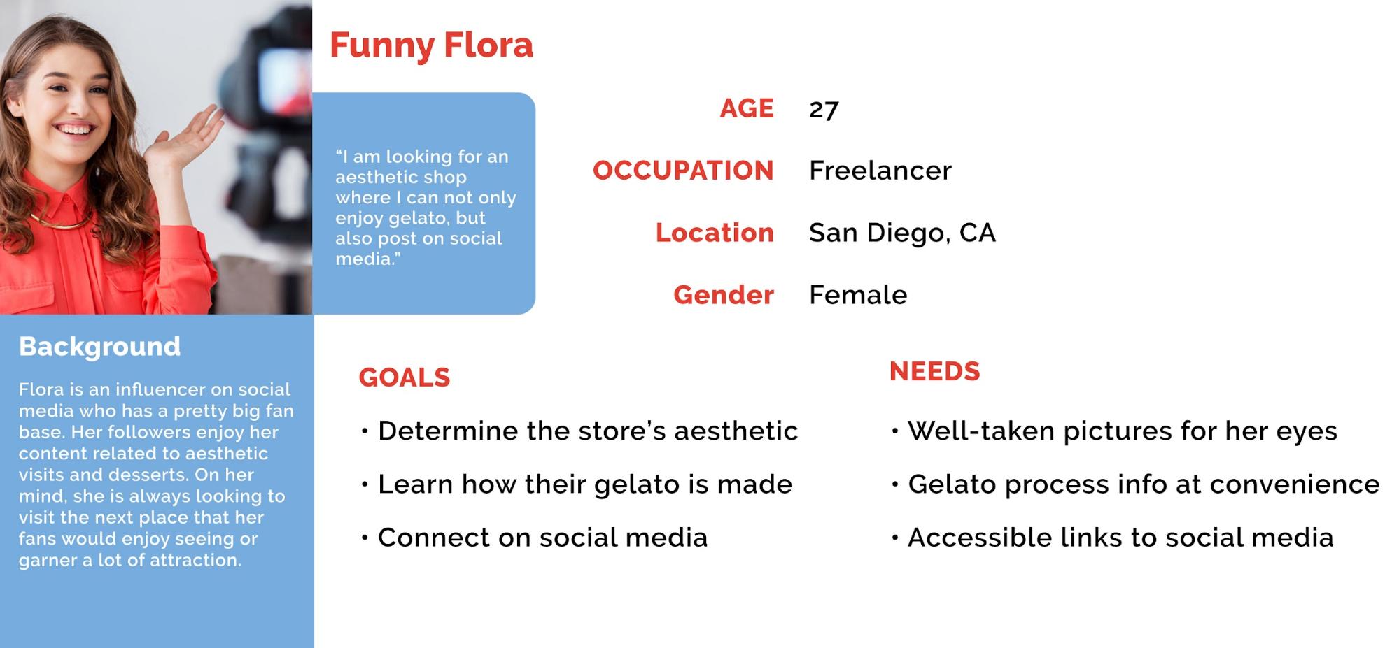
User Peronas

Our clients told us that their regulars are usually 30 to 40 year old locals. They said they started this business as a passion and not for the money– they are not looking to gain more customers but to enhance the experience of current customers.

Sketches

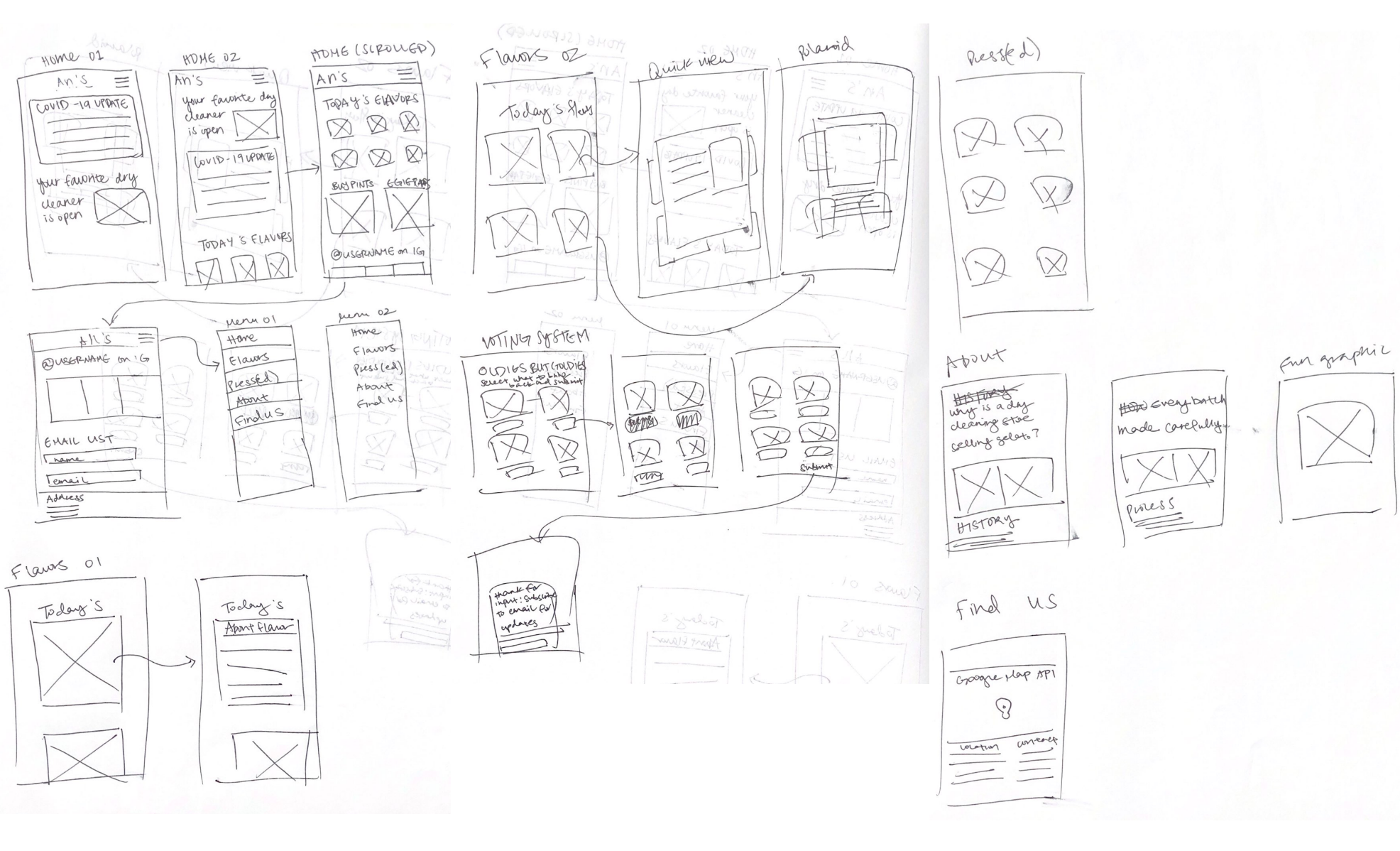
I drew mobile-based wireframes for each page they wanted on their website. I also included a "voting system" for the clients' wish to find out from their customers which are their favorite flavors.

Wireframes

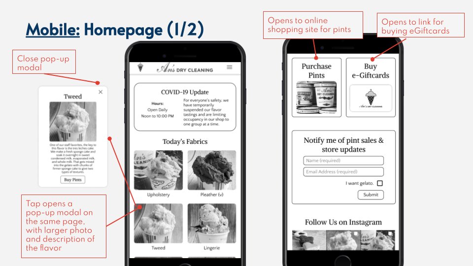
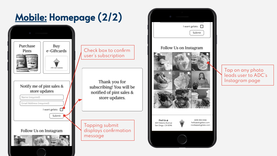
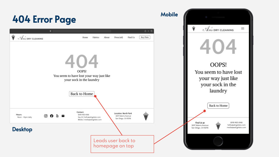
We created wireframes based on our clients' wishes to keep it simple yet informative. We made sure to have COVID updates and the menu up front for customers that simply want to know the current state of the shop. As the user explores the website more, they can find more details about the store.

User Testing

I conducted user testing by givng users a scenario (i.e pretend you want to get ice cream on a date) and a series of tasks to accomplish such as

  1. Plan out which flavor you want to order
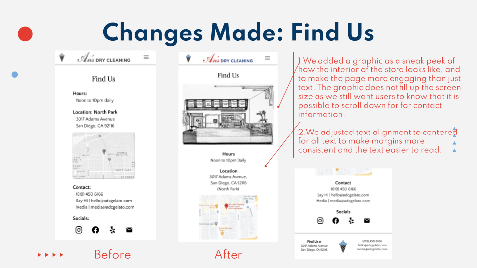
  2. Find the location of the store
  3. Learn more about the establishment so you have something to talk about on your date

After each test, I asked pre-determined follow-up questions to get their feedback.

Results

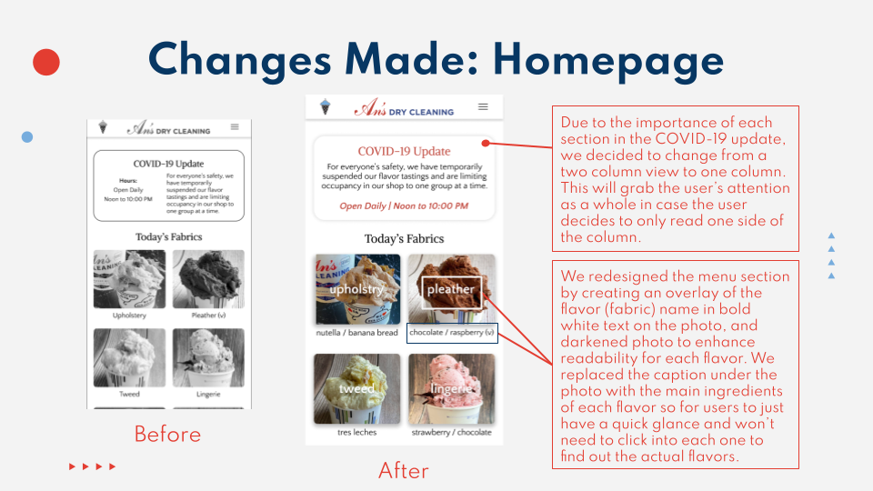
The main issue was looking through the flavors; when browsing, the lack of short ingredient description and having to click/tap on a flavor to read the details was tedious.

Moodboard

Updates

Stay updated

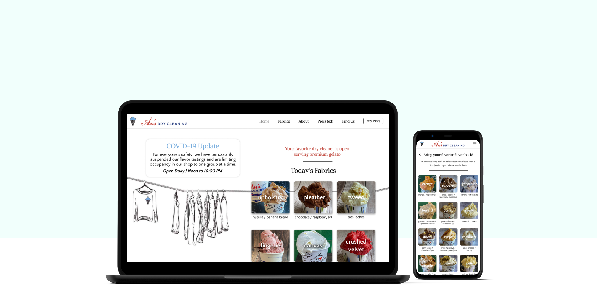
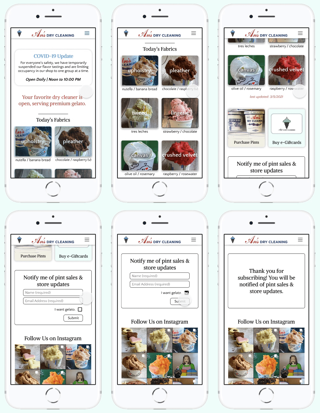
The landing page contains all the daily information a customer needs before and when they go in store.

They can also sign up for the newsletter and purchase pints directly through the site.

Learn about the process

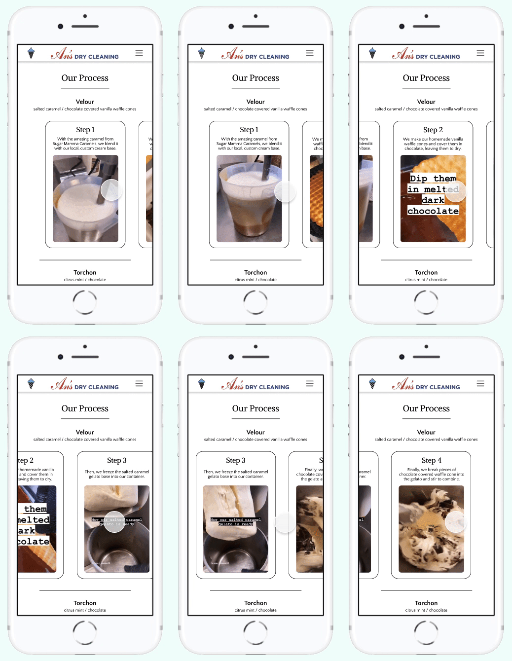
To keep the customers informed about the love and care put into every batch, they can watch and learn how it is made.

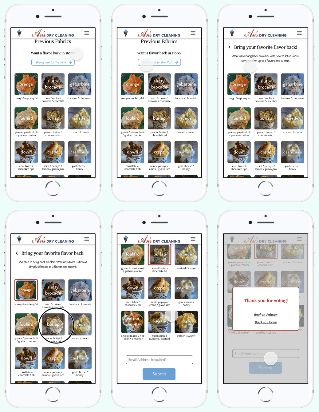
Vote for flavor comeback

Miss a flavor? An's Dry Cleaning wants to give the people what they want!

Special story about each flavor

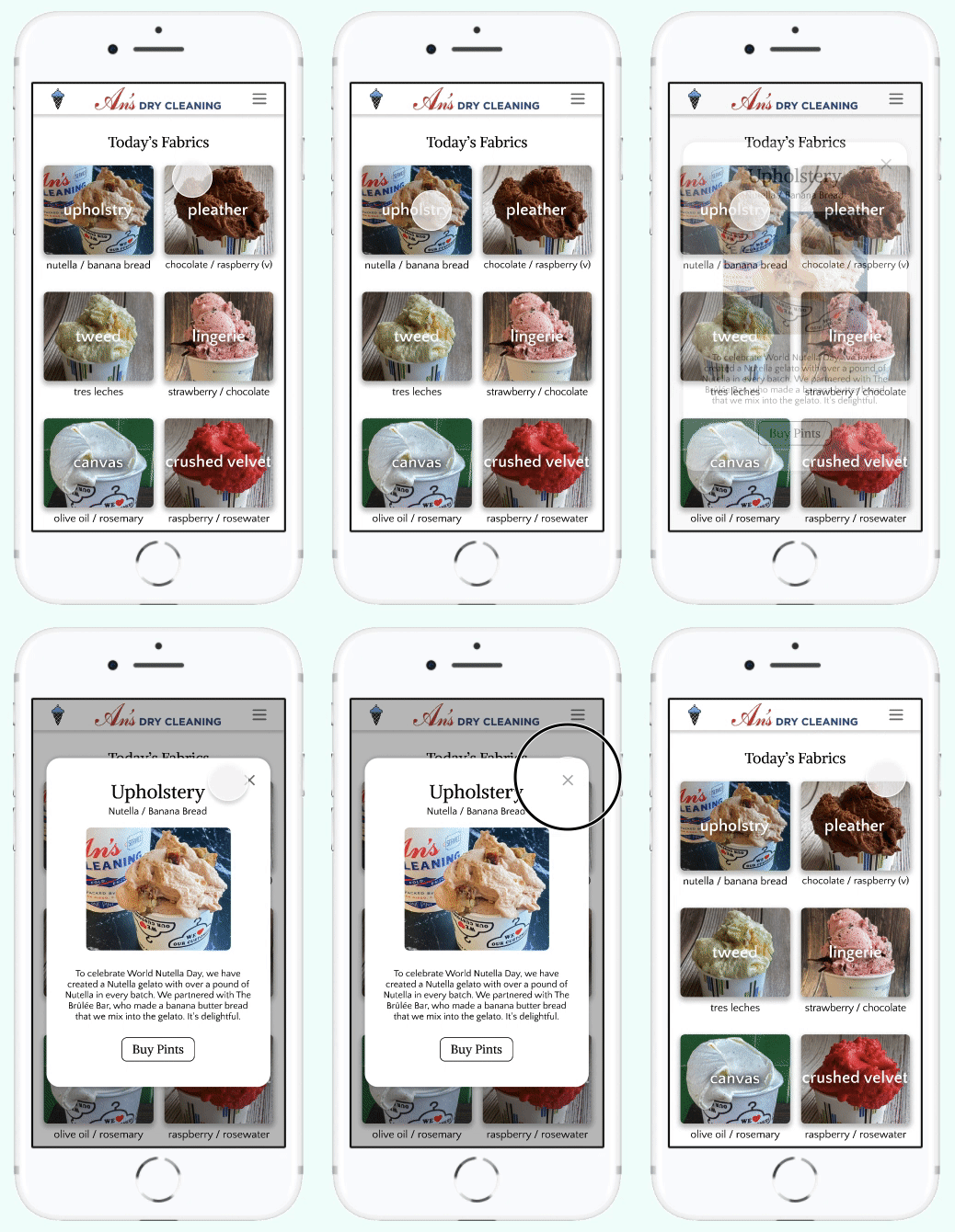
Upon clicking each flavor, users can read more in-depth about them. Because An's Dry Cleaning puts in a lot of effort into each gelato, it would help better connect the customers to their products.

Reflection

This was my first time working with a client! I learned how to balance clients' wants and users' needs. Per our clients' request, they wanted to communicate their humor and uniqueness to their customers but we still had to keep usability in mind. In addition, we had trouble getting in contact with our clients at times and had to make decisions on our own.

Acknowledgements

Thank you to Professor Kirsh and the instructional team for helping us navigate through these constraints. A huge thank you to An's Dry Cleaning for giving us a chance to work with them! Lastly, I want to thank my fellow teammates for sticking it through despite the issues we encountered.